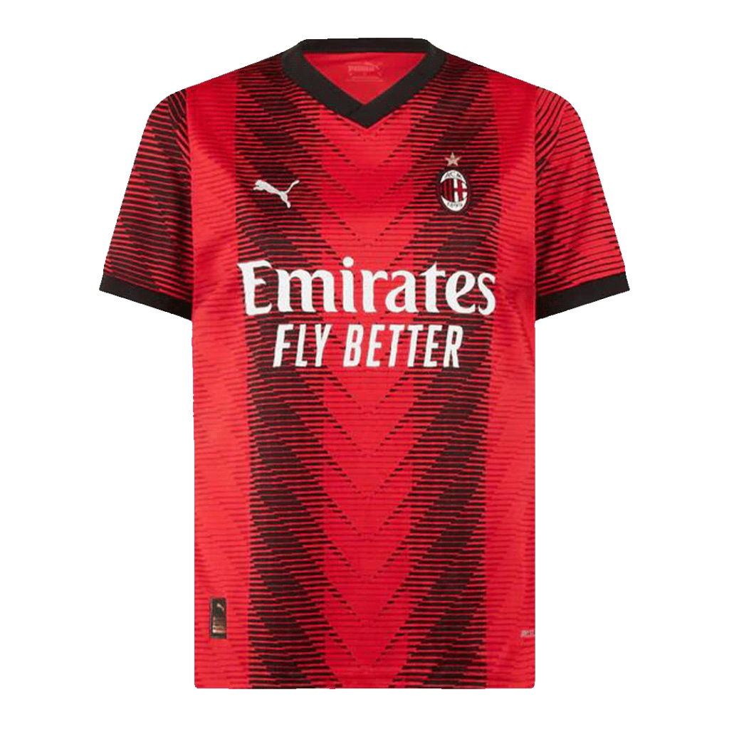
Put a Milan shirt beside an Inter shirt and the family resemblance is immediate: dark vertical stripes, a bright partner colour and the outline of a club crest. Yet the effect is very different. This is a useful place to begin thinking about a football shirt as a piece of design.
The palette comes first
AC Milan’s red and black are central to the club’s own account of its identity. Inter describes black and blue as a constant dating back to its founding in 1908. Those colours give the two clubs a stable visual reference even when a particular season changes the stripes, neckline or sleeve treatment.
Try looking at a shirt as a small thumbnail before you study the details. At that scale, the main colours and the balance of light and dark do most of the work. The crest may be too small to read, but the overall impression is already there.
Count the spaces, not just the stripes
A broad dark band can make a shirt feel quite different from a sequence of narrow ones. Look at whether the centre of the chest is dark or bright, how the pattern meets the shoulder, and whether it continues through the sleeves. These are observations you can make from an image without needing to know the fabric specification.
The sponsor area is another point of contrast. Rather than judging a design only by the name on its front, notice how the lettering sits across the pattern: does it interrupt the stripes, float over them or occupy a plain panel?
Read the quiet details
Collars and cuffs can sharpen a palette or soften it. A small light edge may frame the face; a darker sleeve can make the body pattern feel more pronounced. None of these details needs to be dramatic to change the way a shirt reads.
Our archive lets you compare different references side by side. It is a visual starting point, not a certification of the objects pictured. Begin with the colours, follow the pattern, then look at what changed around the edges.