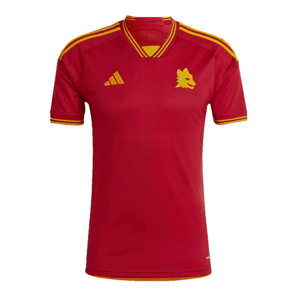
Some football palettes are distinctive before you can read a crest. Roma’s combination of deep red and gold is one of the pairings represented in our archive. It is a useful subject for a visual exercise: how do two familiar colours work together when their proportions change?
Think in proportions
Start with the largest area. A red body with a narrow gold edge creates a different impression from one with a broad contrasting collar. The colours can remain similar while the visual balance shifts. Look at where a secondary colour appears, how often it repeats and how much space it occupies.
Try viewing a reference as a small thumbnail. Details that disappear at that size are doing a different job from a strong border or a large patch of colour. Both can matter, but they guide attention in different ways.
Use the edges
A collar or cuff can frame the main palette without dividing the front of the shirt. A line at the sleeve edge may echo a line at the neck, giving separate parts a sense of connection. This is easy to overlook when you focus only on the centre of the chest.
Make room for the crest
The surrounding colour affects how a badge reads. Look for contrast, the space around the mark and its relationship with other elements across the chest. These observations describe the image; they do not establish how a badge was made or whether the object shown is an official issue.
Read the reference with care
Online colours depend on photography and display settings. Avoid assigning a precise shade from an archive image alone. It is more helpful to describe relationships: warmer or cooler, darker or lighter, narrow trim or broad panel.
Explore the Roma collection and write down one detail you had not noticed before. You may find that it is something quite small. That is often where a familiar colour pairing becomes a particular design.