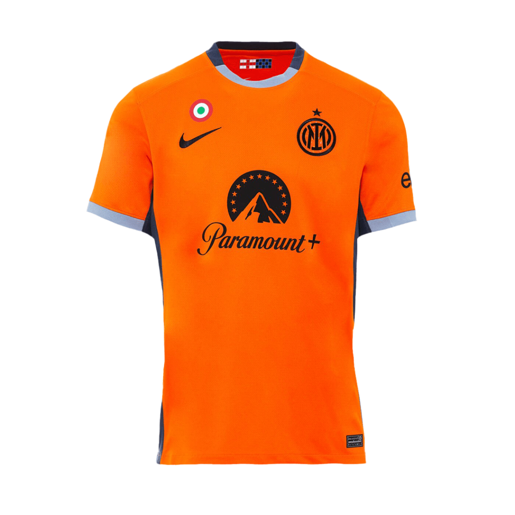
A club’s familiar home colours are often the first thing a supporter pictures. Alternative shirts can be less predictable. They offer a useful way to think about what makes an identity recognisable when its usual colour arrangement changes.
Home as a reference point
For a design comparison, begin with the home shirt as your baseline. Note the main colours, the type of pattern and the placement of the crest. These are the elements you will look for, or deliberately miss, when viewing another design from the same club.
This does not mean that every home shirt follows an identical formula. The point is to establish a reference before comparing variations.
Alternative does not mean unrelated
An away design can create a different mood through a lighter or darker background. A small trim colour may carry the connection with the home palette. Sometimes the strongest link is the crest or the way a graphic is arranged, rather than the largest area of colour.
Try covering the club name in a reference image and asking what still provides a clue. This makes it easier to distinguish a general design convention from something that feels specific to the club.
The third-shirt label
Collections often group designs under home, away and third labels. These are useful organisational terms, but a label alone does not tell you the exact matches in which a design appeared or whether a particular example was worn. Verify a specific season or match claim with a primary club reference.
Our archive inherited titles from an earlier image collection. Some descriptions may use overlapping terms such as “third away”. We retain those as reference labels rather than treating them as definitive historical classifications.
Build a comparison
Pick three designs from one club and compare four things: the main background, the contrast colour, the neckline and the crest treatment. A small table or a few sentences can make the relationship clearer than a ranking of favourites.
The interesting question is not only which shirt you prefer. It is how much a design can change while still connecting to the same club. That tension between continuity and experimentation gives alternative kits much of their appeal.